Time Series Plots
Time-series EDA assumes the model y = f(t) + e — a signal component plus random error. The plots in this section reveal dominant frequencies, autocorrelation structure, and the amplitude/phase evolution of the signal.
All time-series plots require a continuous index variable t
(not restricted to calendar time — scan number, wavelength, and
position all qualify).
Reference: NIST Handbook Chapter 1.3.3
%matplotlib inline
import numpy as np
import matplotlib.pyplot as plt
from drippy import EDAData
from drippy import (
    run_sequence_plot,
    spectral_plot,
    autocorrelation_plot,
    complex_demodulation_amplitude_plot,
    complex_demodulation_phase_plot,
)

rng = np.random.default_rng(42)

# 200-point sinusoidal signal — beam-deflection-like measurement
t = np.linspace(0, 10, 200)
noise = rng.normal(scale=0.5, size=200)
y = 2.0 * np.sin(2 * np.pi * 0.5 * t) + noise
data = EDAData(y=y, t=t)
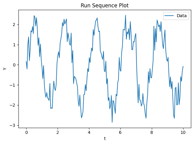
Run Sequence Plot (NIST 1.3.3.25)
The run-sequence plot is the natural first step for time-series data.
When t is provided, it becomes the x-axis, giving the correct physical
scale.
fig, ax = run_sequence_plot(data)
plt.show()
Spectral Plot (NIST 1.3.3.27)
The Lomb-Scargle periodogram estimates the power spectral density, identifying dominant frequencies even for unevenly-sampled data. Optional false alarm probability (FAP) levels flag statistically significant peaks.
fig, ax = spectral_plot(data)
plt.show()
/home/docs/checkouts/readthedocs.org/user_builds/drippy/envs/latest/lib/python3.12/site-packages/astropy/timeseries/periodograms/lombscargle/_statistics.py:140: RuntimeWarning: invalid value encountered in scalar power
  return (1 - z) ** (0.5 * Nk)
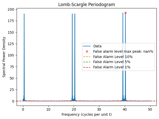
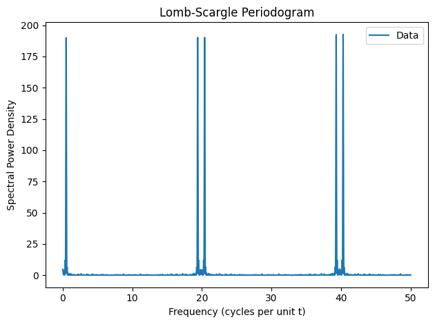
The dominant peak at 0.5 Hz recovers the known signal frequency. Without alarm levels:
fig, ax = spectral_plot(data, alarm_levels=False)
plt.show()
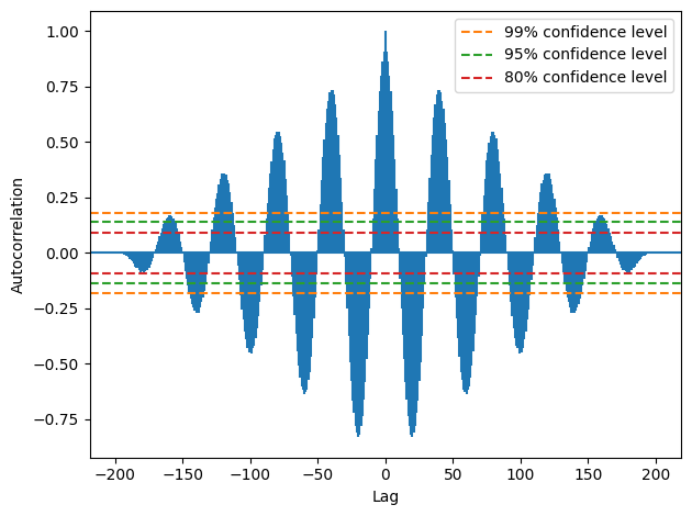
Autocorrelation Plot (NIST 1.3.3.1)
Plots the autocorrelation function (ACF) with 80%, 95%, and 99% confidence bands. Lags whose bars exceed the bands indicate significant autocorrelation — evidence of non-randomness at that lag.
fig, ax = autocorrelation_plot(data)
plt.show()
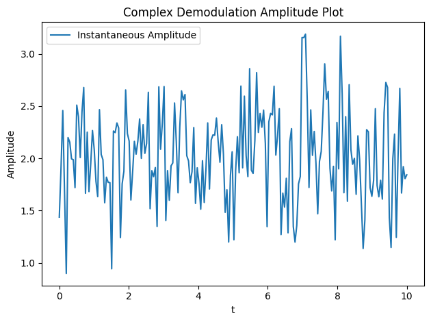
Complex Demodulation Amplitude Plot (NIST 1.3.3.11)
Demodulates the signal at its dominant frequency and plots the instantaneous amplitude envelope. A flat envelope indicates a stationary amplitude; rising or falling envelopes reveal non-stationarity.
fig, ax = complex_demodulation_amplitude_plot(data)
plt.show()
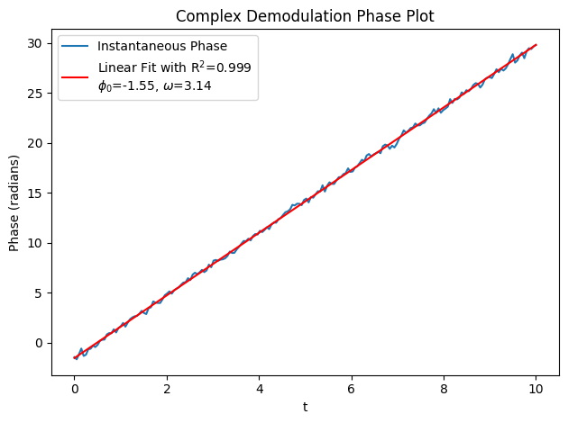
Complex Demodulation Phase Plot (NIST 1.3.3.12)
Plots the unwrapped instantaneous phase with a linear trend fit. Deviations from the trend indicate frequency modulation or phase noise in the signal.
fig, ax = complex_demodulation_phase_plot(data)
plt.show()