Regression Plots
Regression EDA assumes the model y = f(x) + e with a continuous
predictor x. These plots diagnose the fit quality and stability of a
linear regression as a function of position in x.
Pass x as a continuous numeric array to EDAData.
Reference: NIST Handbook Chapter 4
%matplotlib inline
import numpy as np
import matplotlib.pyplot as plt
from drippy import EDAData
from drippy import (
    scatter_plot,
    six_plot,
    linear_correlation_plot,
    linear_intercept_plot,
    linear_slope_plot,
    linear_residual_sd_plot,
)

rng = np.random.default_rng(42)

# 50-point calibration curve
x = np.linspace(0, 10, 50)
y = 2.5 * x + 3.0 + rng.normal(scale=1.5, size=50)
data = EDAData(y=y, x=x)
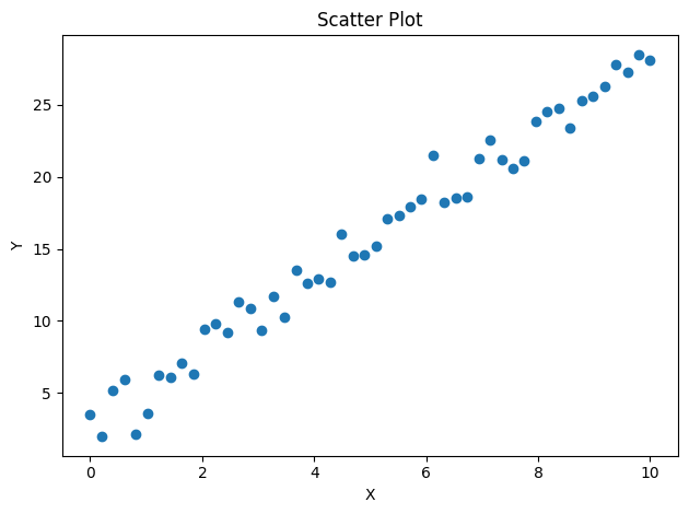
Scatter Plot (NIST 1.3.3.26)
The starting point for any regression EDA: raw y vs x to confirm
linearity and spot outliers before fitting.
fig, ax = scatter_plot(data)
plt.show()
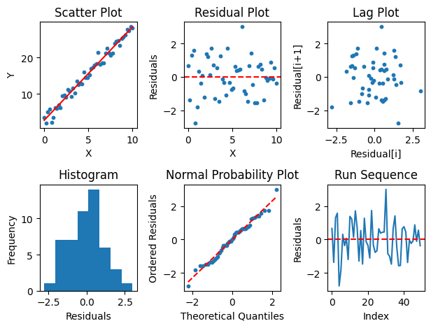
6-Plot (NIST 1.3.3.33)
Comprehensive regression diagnostic in a 2×3 grid:
Scatter with fitted line
Residuals vs x
Lag plot of residuals
Histogram of residuals
Normal probability plot of residuals
Run sequence of residuals
If residuals in panels 2–6 look like white noise, the linear model is adequate.
fig, axes = six_plot(data)
plt.show()
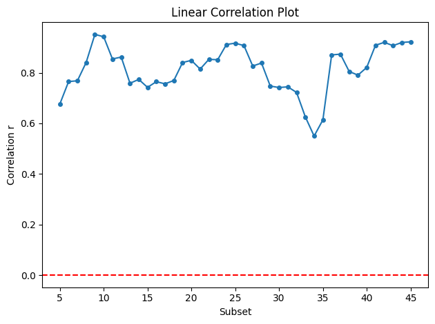
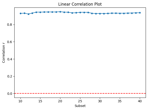
Linear Correlation Plot (NIST 1.3.3.16)
Plots the Pearson correlation coefficient from a rolling window of observations. Stable, high correlation confirms that the linear model holds throughout the data range; dips indicate local non-linearity.
fig, ax = linear_correlation_plot(data)
plt.show()
fig, ax = linear_correlation_plot(data, window=20)
plt.show()
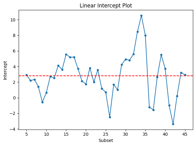
Linear Intercept Plot (NIST 1.3.3.19)
Rolling OLS intercept. Drift in the intercept over the data sequence may indicate calibration shift or a non-stationary baseline.
fig, ax = linear_intercept_plot(data)
plt.show()
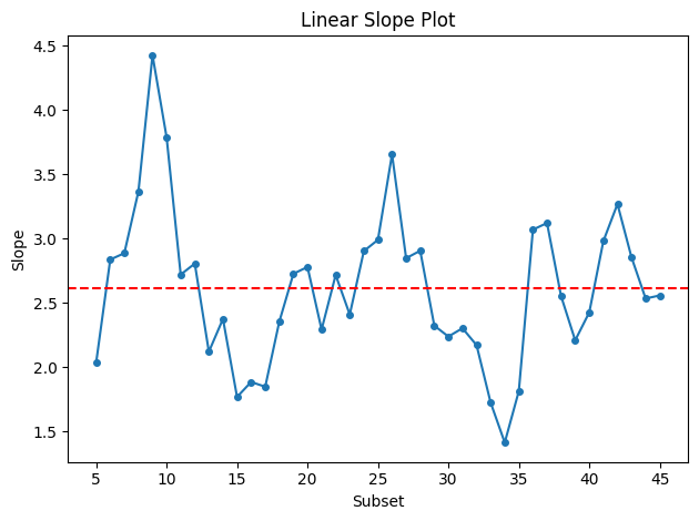
Linear Slope Plot (NIST 1.3.3.20)
Rolling OLS slope (sensitivity). A flat line confirms constant sensitivity; trends reveal systematic changes in the response.
fig, ax = linear_slope_plot(data)
plt.show()
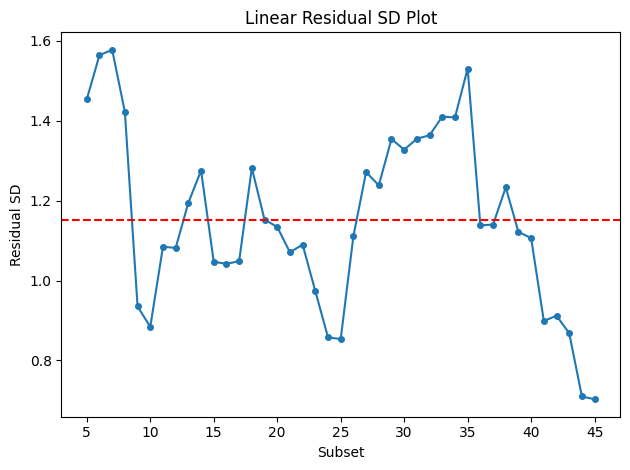
Linear Residual SD Plot (NIST 1.3.3.22)
Rolling residual standard deviation. Increasing SD indicates
heteroscedasticity — variance that grows with x.
fig, ax = linear_residual_sd_plot(data)
plt.show()