One-Factor Plots
One-factor EDA assumes the model y = f(x) + e. x is typically a
categorical factor (batch, machine, operator, treatment group) and the
plots answer: do the factor levels produce different location or spread?
Pass x to EDAData as a 1-D array of labels or numbers, matching len(y).
Reference: NIST Handbook Chapter 1.3.3
%matplotlib inline
import numpy as np
import matplotlib.pyplot as plt
from drippy import EDAData
from drippy import (
    scatter_plot,
    box_plot,
    bihistogram,
    qq_plot,
    mean_plot,
    sd_plot,
)

rng = np.random.default_rng(42)

# Five production batches — 20 observations each
batches = ["B1", "B2", "B3", "B4", "B5"]
x_cat = np.repeat(batches, 20)
locs = [5.0, 5.5, 4.8, 5.2, 5.1]
y_cat = np.concatenate(
    [rng.normal(loc=l, scale=1.0, size=20) for l in locs]
)
data_cat = EDAData(y=y_cat, x=x_cat)

# Two-group comparison — 30 observations each
x_two = np.repeat(["Method_A", "Method_B"], 30)
y_two = np.concatenate(
    [rng.normal(10.0, 1.0, 30), rng.normal(10.5, 1.2, 30)]
)
data_two = EDAData(y=y_two, x=x_two)
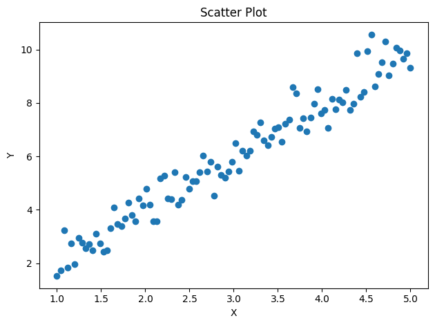
Scatter Plot (NIST 1.3.3.26)
Raw scatter of y vs x. Works with both continuous and categorical x.
The simplest way to spot location differences, outliers, or non-linearity.
x_cont = np.linspace(1, 5, 100)
y_cont = 2.0 * x_cont + rng.normal(scale=0.5, size=100)
data_cont = EDAData(y=y_cont, x=x_cont)

fig, ax = scatter_plot(data_cont)
plt.show()
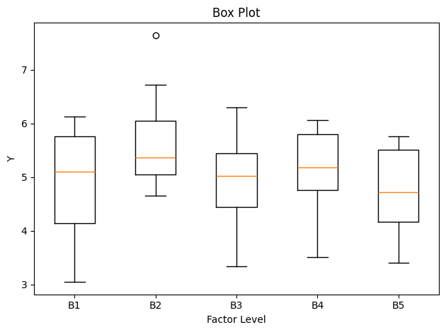
Box Plot (NIST 1.3.3.7)
Displays median, interquartile range, and outliers for each factor level. Ideal for comparing location and spread across many groups simultaneously.
fig, ax = box_plot(data_cat)
plt.show()
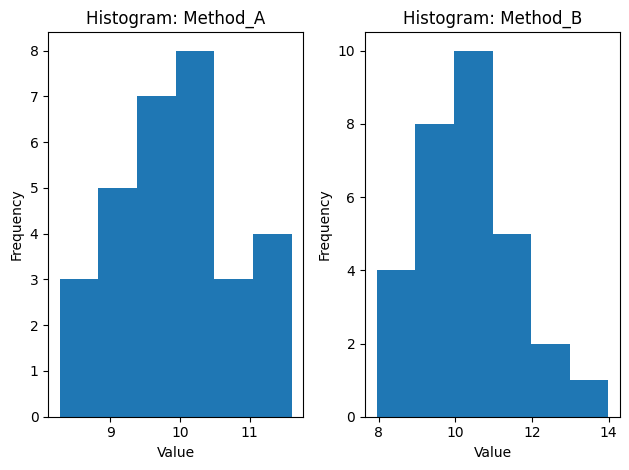
Bihistogram (NIST 1.3.3.2)
Side-by-side histograms for exactly two factor levels. The mirrored layout makes it easy to compare distribution shape, location, and spread between, for example, two measurement methods or two labs.
fig, axes = bihistogram(data_two)
plt.show()
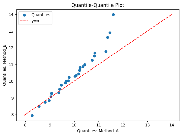
Q-Q Plot (NIST 1.3.3.23)
Quantile-quantile plot comparing two groups. Points on the diagonal indicate identical distributions; vertical shifts indicate location differences; changes in slope indicate scale differences.
fig, ax = qq_plot(data_two)
plt.show()
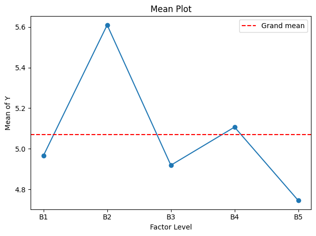
Mean Plot (NIST 1.3.3.17)
Group means connected by a line, with a grand-mean reference. A flat line indicates no factor effect; visible trends or steps suggest systematic differences between levels.
fig, ax = mean_plot(data_cat)
plt.show()
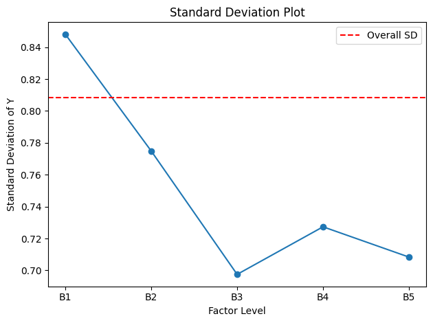
SD Plot (NIST 1.3.3.28)
Group standard deviations connected by a line, with a pooled-SD reference. Detects heteroscedasticity — factor levels with unusually high or low variability.
fig, ax = sd_plot(data_cat)
plt.show()