Comparative Plots
Comparative EDA addresses questions that arise in interlaboratory studies, block designs, and multivariate profiling:
Block plot — do treatment effects replicate across blocks (labs, operators)?
Youden plot — do two labs agree, and is any disagreement a shift or a scale change?
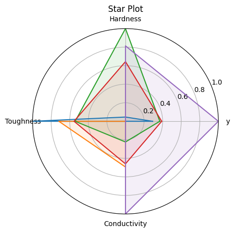
Star plot — what is the multivariate profile of each specimen?
Reference: NIST Handbook Chapter 2.5
%matplotlib inline
import numpy as np
import matplotlib.pyplot as plt
from drippy import EDAData
from drippy import block_plot, youden_plot, star_plot

rng = np.random.default_rng(42)
Block Plot (NIST 1.3.3.3)
Shows treatment effects within each block as connected lines — one line per block. If lines are parallel, the treatment effect is consistent across blocks (no block × treatment interaction).
Requires factors with keys "treatment" and "block".
# 8 blocks (labs), 2 treatments per block
treatments = np.tile(["T1", "T2"], 8)
blocks = np.repeat([f"Lab{i}" for i in range(1, 9)], 2)
y_block = rng.normal(size=16) + (treatments == "T2") * 0.8
data_block = EDAData(
    y=y_block,
    factors={"treatment": treatments, "block": blocks},
)

fig, ax = block_plot(data_block)
plt.show()
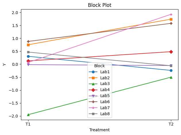
In this simulated run, T2 generally scores higher than T1 across most labs — the lines are approximately parallel, suggesting limited lab × treatment interaction.
Youden Plot (NIST 1.3.3.31)
Compares measurements from two labs on the same set of specimens.
Pass Lab 1 as y and Lab 2 as x.
Points on the diagonal: labs agree
Vertical shift from diagonal: Lab 1 bias
Points scattered off diagonal: random lab-to-lab variability
# 20 specimens measured by two labs
lab1 = rng.normal(loc=10.0, scale=0.5, size=20)
lab2 = lab1 + rng.normal(loc=0.2, scale=0.3, size=20)  # Lab 2 has a slight bias
data_youden = EDAData(y=lab1, x=lab2)

fig, ax = youden_plot(data_youden)
plt.show()
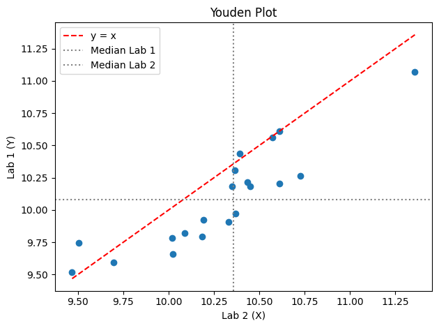
The median lines reveal a small positive bias in Lab 2 relative to Lab 1.
Star Plot (NIST 1.3.3.29)
Radar / spider chart for multivariate data. Each spoke represents one variable (normalised 0–1); each polygon represents one observation.
Pass additional variables via factors. The response variable y
appears automatically as the first spoke.
# 5 specimens characterised by 4 material properties
n = 5
hardness = rng.uniform(0.4, 1.0, n)
toughness = rng.uniform(0.3, 0.9, n)
conductivity = rng.uniform(0.1, 0.8, n)
strength = rng.uniform(0.5, 1.0, n)
data_star = EDAData(
    y=strength,
    factors={
        "Hardness": hardness,
        "Toughness": toughness,
        "Conductivity": conductivity,
    },
)

fig, ax = star_plot(data_star)
plt.show()